🔍 What is this about?
In today’s biotechnology and life sciences world, experiments generate massive amounts of data — from DNA sequences to enzyme activity curves to entire transcriptomes.
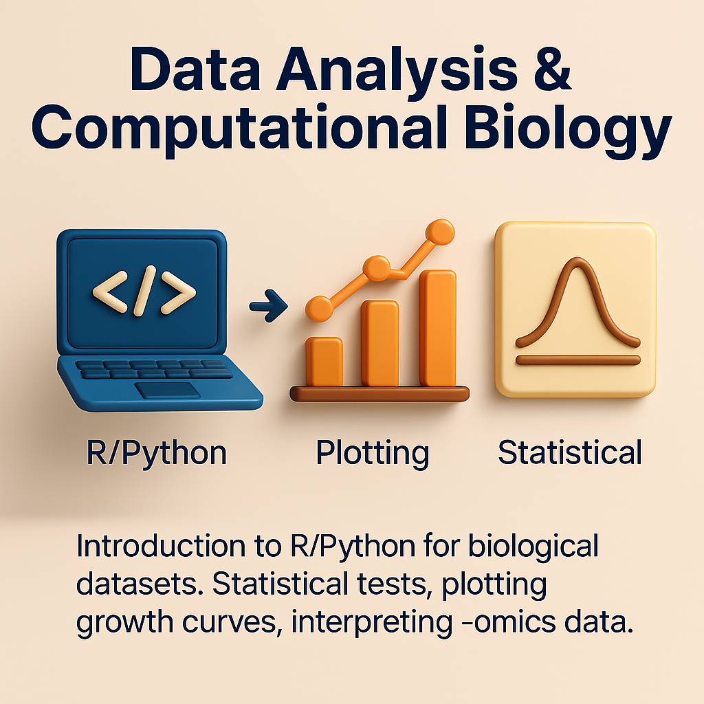
Data analysis & computational biology teach students how to handle, analyze, visualize, and make sense of this biological data using tools like R and Python.
It’s where biology meets statistics & coding.
🐍 Why learn R or Python?
- R is widely used in bioinformatics for statistics & beautiful plots (via
ggplot2), plus specialized packages likeBioconductor. - Python is flexible, has powerful libraries (
Pandas,NumPy,Seaborn,Scikit-learn) for data cleaning, visualization, and even machine learning.
Knowing these makes students capable of analyzing experiments themselves — rather than waiting for a “data person.”
📊 What types of analyses are common?
| Type of analysis | Why do it? |
|---|---|
| Statistical tests | Check if differences (e.g. between treated vs. control) are significant. E.g. t-tests, ANOVA. |
| Plotting growth curves | Visualize how bacteria or enzyme reactions change over time. |
| -Omics data interpretation | From RNA-seq counts, identify up/down-regulated genes, or from proteomics, spot key proteins. |
| Heatmaps & clustering | Group similar genes/samples based on expression patterns. |
| Machine learning basics | Predict outcomes, classify samples (e.g. cancer vs. normal). |
🔄 Mini workflow diagram: typical biological data analysis
Raw data (lab or sequencing)
    ↓
Data cleaning (remove errors, format tables)
    ↓
Statistical analysis (find significant differences)
    ↓
Visualization (plots, heatmaps, networks)
    ↓
Biological interpretation (pathways, phenotypes)
📝 Example case study: analyzing enzyme kinetics
🧪 Scenario
A lab runs an experiment testing how an enzyme reacts to different substrate concentrations.
🖥️ Using R or Python, they:
- Enter data in a CSV: substrate concentration vs. reaction rate.
- Plot the Michaelis-Menten curve to estimate Vmax and Km.
- Use
scipy.optimize.curve_fitin Python ornls()in R to fit the curve.
🎯 What does it tell them?
- The enzyme’s efficiency under lab conditions.
- Helps compare wild-type vs. mutant enzyme performance.
✅ Short summary table
| Tool / Concept | Used for | Example |
|---|---|---|
| R / ggplot2 | Beautiful statistical plots, e.g. boxplots | Visualize gene expression across conditions |
| Python / Pandas | Clean & manipulate large datasets | Filter out low-quality reads from RNA-seq data |
| Statistical tests | Check significance (p-value) | See if treated group differs from control |
| Heatmaps / clustering | Visualize large -omics datasets | Group genes by similar expression patterns |
| Pathway enrichment tools | Link gene lists to biology | Find affected pathways in cancer samples |
